

Case study · Own brand
The method, applied to my own brand.

Before asking anyone to trust my method, I applied it to the closest thing I have: my own name. These are the decisions behind Elvira Fernández, and why each one is there.
- Brand
- Elvira Fernández
- Scope
- Positioning, visual system, tone and website
- Languages
- English and Spanish
- Logo
- Since 2024 · refreshed in 2026
This case documents my own brand. It is not a client project.
Discover
The starting point.
I had a rounded, warm and recognisable logo that I have used since 2024. And an independent practice that needed to convey more: strategic judgment, editorial sensibility and international reach, without losing its warmth.
What does a personal brand look like when it is both strategic and human?
Define
What the brand promises.
Independent creative director and brand strategist: a direct relationship, a global perspective, strategic clarity and creative judgment. Considered direction, not promises of instant success.
Five pillars
- IntentionalEvery visual and strategic choice earns its place.
- ArticulateComplex business ideas, translated into clarity.
- DistinctivePersonality within sophistication, not a generic template.
- PersonalYou work with me, not with an anonymous team.
- InternationalCross-cultural sensitivity, English and Spanish, based in Costa Rica.
The claim
Creative thinking.
Intentional impact.
It stays in English in both languages: it is part of the identity, like the logo.
Express · Logo
Keeping the original logo.
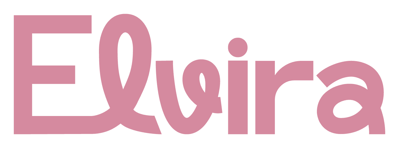
I explored a more formal serif alternative and set it aside: the 2024 logo has a round, warm personality that already feels like me. The original drawing isn’t mine; the concept and the variations are. I did not redraw it: only its colour changed, and everything around it became editorial to make it contemporary.
Express · Colour
A palette with rules.
Six colours, each with a role. Burgundy carries the big statements; ivory gives room to breathe; rose, sage and clay bring warmth to surfaces and details.
- Ink#29262AText, logo and dark sections
- Burgundy#6D344CMain accent and large headlines
- Rose#CD98A8Details and broad surfaces
- Ivory#F6F1EBThe dominant canvas
- Sage#A9AD9CVisual detail and support
- Clay#C9BDB5Soft surfaces and dividers
Accessibility rule: rose, sage and clay are never text on ivory, because they lack enough contrast. Text is set in ink or burgundy.
Express · Typography
70% editorial, 30% character.
An editorial serif for headlines and a clear sans for reading. Together they counterbalance the rounded logo: sophisticated without feeling cold.
DM Serif Display · headlines
Instrument Sans · text and interface
Understand first. Create with intention. Every visual and verbal decision serves the same purpose.
Express · Symbol
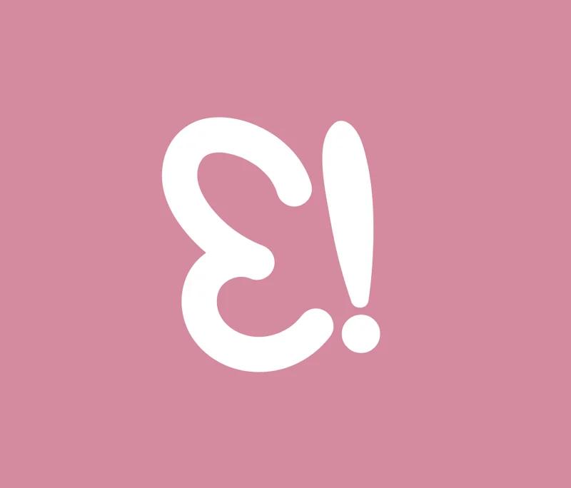
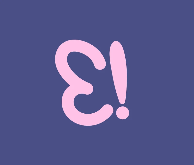
The E! as a signature.
The logo’s symbol, half a butterfly, became a system: one sign with many uses.
- Favicon
- Rotating stamp
- Site cursor
- Watermark
- The whole butterfly, closing every page
Express · Variations
A family, not a single logo.
The “Elvira” wordmark, the full name, the E! and the whole butterfly, each with its place. The concept and the variations are mine; the original 2024 drawing of the logo is not.
Wordmark
Header and documents
Full name
Footer and signature
E! symbol
Favicon, cursor and stamp
The butterfly
Two E!, one mirrored, sharing one body
The brand in use
Tap each use to see it live on this site.
The intro
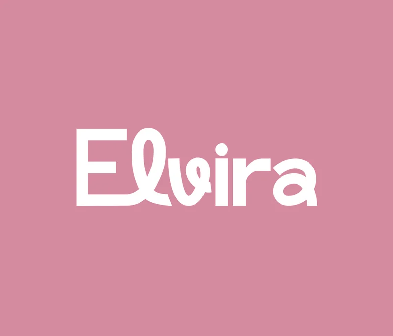
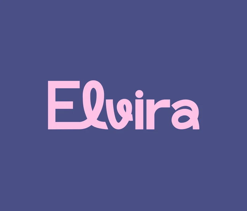
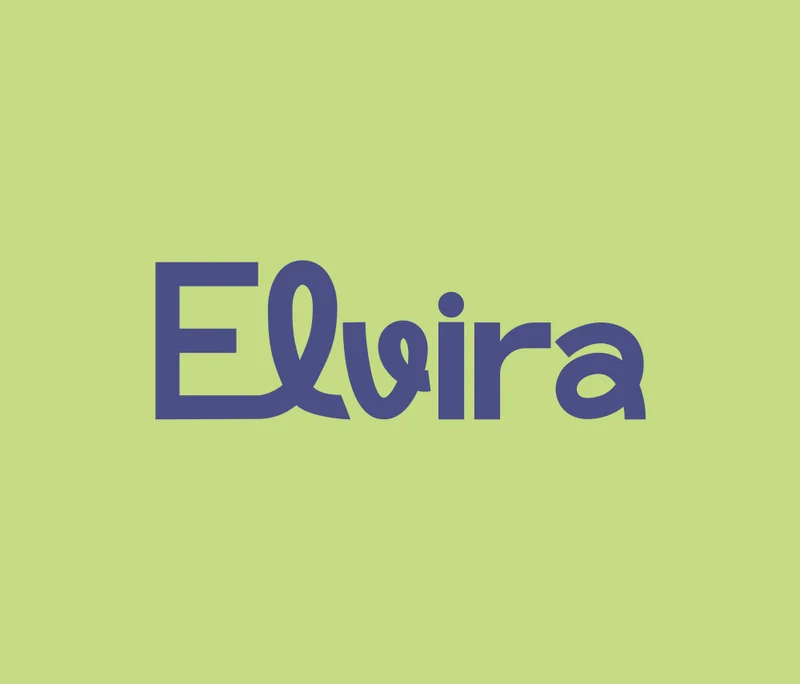
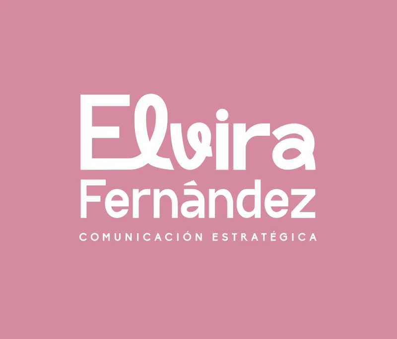
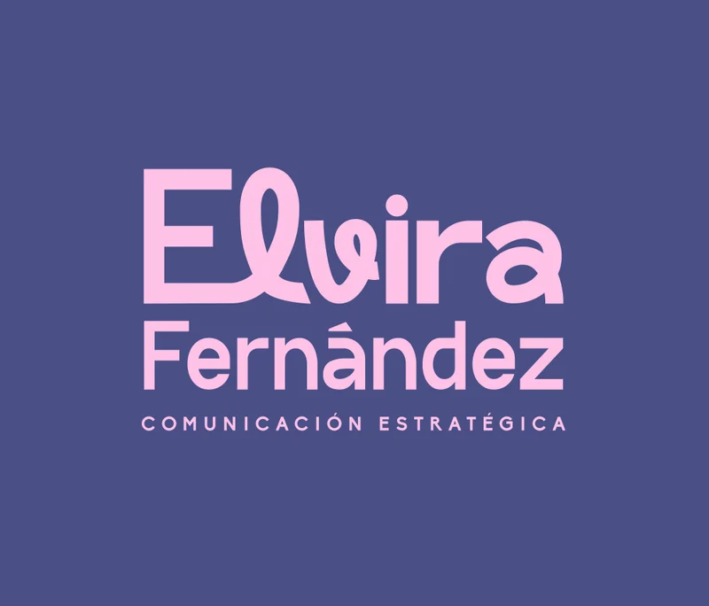
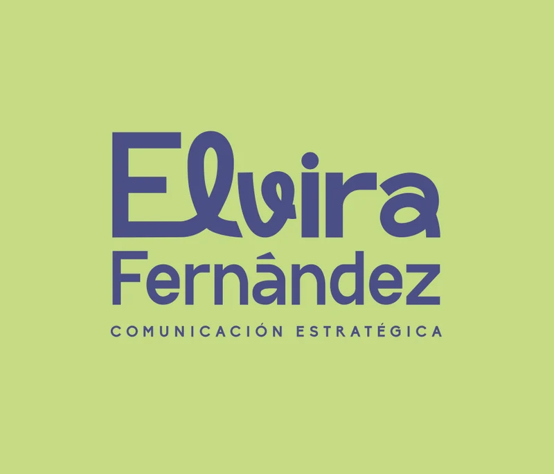
The original 2024 variations
The same drawings on the palette the brand was born with.

Express · Decisions
Three non-negotiables.
Credibility without invention
No logos of clients that are not mine, no numbers, no invented client quotes. Work I did as an employee is not presented as my own portfolio. Credibility comes from clarity.
A site to use, not just to look at
A lab with four tools so anyone can think through their brand before writing to me: a diagnostic, a positioning sentence, a direction mixer and a moodboard.
For everyone
Genuinely bilingual, accessible to WCAG 2.2 AA, with motion that follows the scroll and stops if you prefer less motion.
The outcome
A system that works everywhere.
A brand I can apply consistently on this site, on LinkedIn, in proposals and in presentations. And an honest example of how I work: understand first, create with intention.
Another case
See the Sculpt Society caseNext step
Let’s do the same for your brand.
The same method, applied to what you are building.